Historic UK meteorological & climate data

How has temperature changed over time across the different countries in the UK?

Code
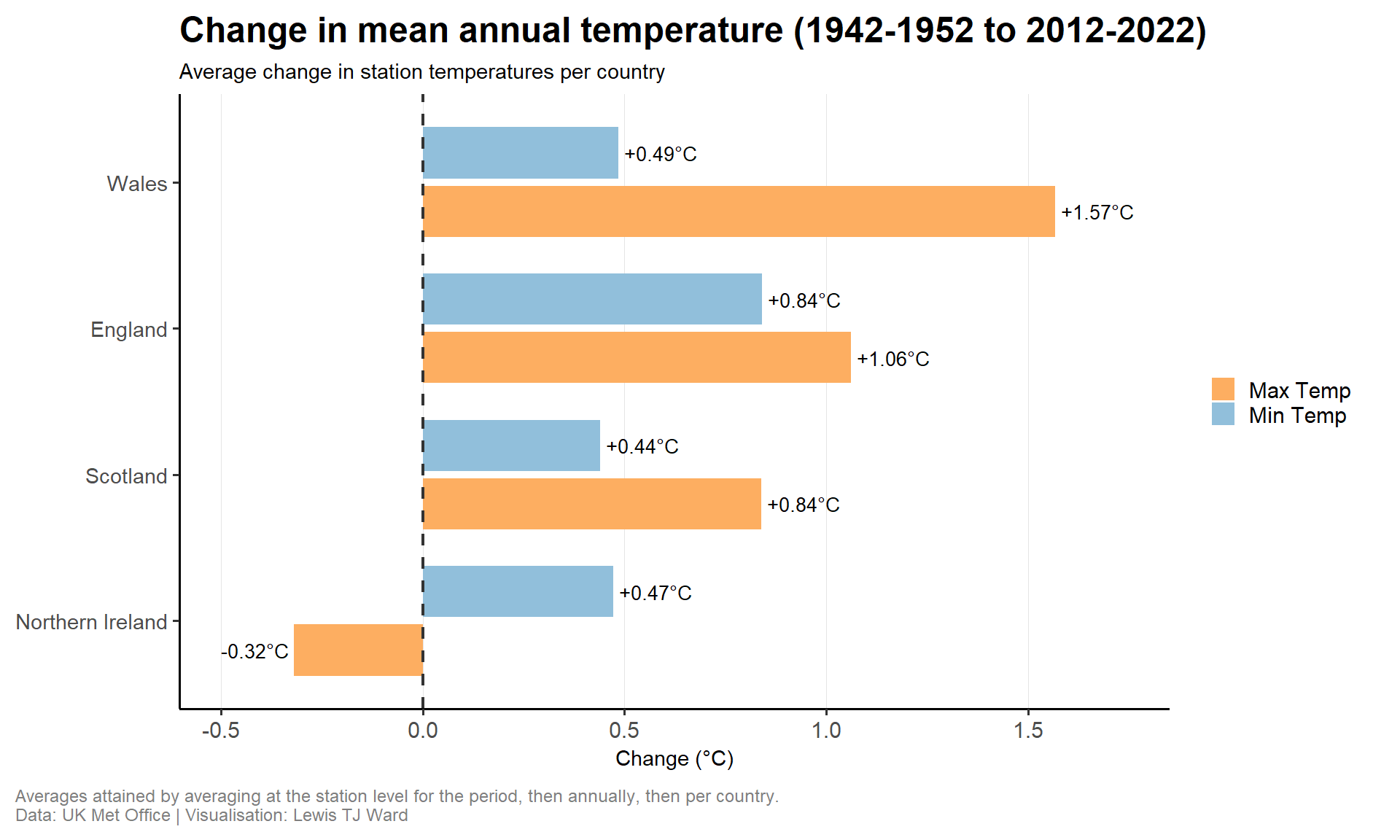
plot_temp_change <- temp_change |>
  ggplot(aes(x = country, y = change, fill = variable)) +
  geom_col(position = position_dodge(width = 0.8), width = 0.7) +
  geom_text(
    aes(
      label = change_label,
      hjust = ifelse(change >= 0, -0.08, 1.08)
    ),
    position = position_dodge(width = 0.8),
    size = 3.5,
    color = "black"
  ) +
  geom_hline(
    yintercept = 0,
    linetype = "dashed",
    color = "grey20",
    linewidth = 0.75
  ) +
  coord_flip(clip = "off") +
  scale_fill_manual(
    values = c("Max Temp" = "#fdae61", "Min Temp" = "#91bfdb"),
    name = NULL
  ) +
  scale_y_continuous(
    expand = expansion(mult = c(0.15, 0.15)),
    breaks = pretty_breaks(n = 8)
  ) +
  labs(
    title = paste0(
      "Change in mean annual temperature (",
      early_start, "-", early_end, " to ",
      recent_start, "-", recent_end, ")"
    ),
    subtitle = "Average change in station temperatures per country",
    x = NULL,
    y = "Change (°C)",
    caption = "Averages attained by averaging at the station level for the period, then annually, then per country.\nData: UK Met Office | Visualisation: Lewis TJ Ward"
  ) +
  theme_tt() +
  theme(
    panel.grid.major.y = element_blank(),
    panel.grid.major.x = element_line(color = "grey90", linewidth = 0.3)
  )

ggsave(
  here("years", "2025", "42", "output", "mean_annual_temp_changes.png"),
  plot = plot_temp_change,
  width = 10,
  height = 6,
  dpi = 300
)

plot_temp_change

Does rainfall change across the different countries in the UK?

Code
plot_rain_anomaly_year <- country_annual_rain |>
  ggplot(aes(x = year, y = rain_anomaly, fill = drought_flag)) +
  geom_vline(
    xintercept = country_annual_rain$year,
    color = "grey80",
    linetype = "dotted",
    linewidth = 0.3
  ) +
  geom_col(width = 0.6) +
  geom_text(
    data = subset(country_annual_rain, drought_flag == "<5th percentile"),
    aes(
      label = year,
      vjust = ifelse(rain_anomaly >= 0, -0.2, 1.2)
    ),
    size = 3.5,
    fontface = "bold",
    color = "black"
  ) +
  geom_hline(
    yintercept = 0,
    linetype = "dashed",
    color = "grey20",
    linewidth = 0.75
  ) +
  facet_wrap(~country, scales = "fixed") +
  scale_x_continuous(breaks = seq(
    min(country_annual_rain$year),
    max(country_annual_rain$year),
    by = 5
  )) +
  scale_fill_manual(
    values = c(
      "<5th percentile" = "#d7191c",
      "<25th percentile" = "#fdae61",
      "≥25th percentile" = "#91bfdb"
    ),
    name = "Annual Rainfall\nPercentile"
  ) +
  scale_y_continuous(
    expand = expansion(mult = c(0.15, 0.15)),
    breaks = pretty_breaks(n = 8)
  ) +
  labs(
    title = "Average annual rainfall versus long-term mean per country (1989-2024)",
    subtitle = "<5th percentile years labeled in red | <25th percentile years in orange",
    x = "Year",
    y = "Difference from long-term average (mm)",
    caption = "Difference calculated as annual rainfall minus long-term mean per station and country.\nData: UK Met Office | Visualisation: Lewis TJ Ward"
  ) +
  theme_tt() +
  theme(
    axis.text.x = element_text(angle = 45, hjust = 1),
    panel.grid.major.y = element_line(color = "grey90", linewidth = 0.3),
    panel.grid.major.x = element_blank()
  )

ggsave(
  here("years", "2025", "42", "output", "annual_rainfall_changes.png"),
  plot = plot_rain_anomaly_year,
  width = 11,
  height = 6,
  dpi = 300
)

plot_rain_anomaly_year